Websites for HR Platforms, Associations and Data Portals
HR association website and directory design that works: clear navigation, searchable directories, usable data portals, and a fast, accessible site.
 Written byMatt Gemi, Founder, Urest
On this page
An HR association website, a member directory, and a labour-market data portal share a challenge that ordinary marketing sites do not face: they have to organise a large amount of information so that busy professionals can find exactly what they need, fast. Get the structure right and the site becomes a daily tool people rely on. Get it wrong and even valuable data goes unused.
Why does structure matter so much on these sites?
For content-heavy platforms, information architecture is not a preliminary step, it is the product. Before styling anything, the real work is deciding how members, resources, directory entries, and data are categorised, labelled, and connected. Navigation should match how your audience thinks, using their terms rather than your internal org chart.
A visitor should always know where they are, how they got there, and how to get back. Clear categories, sensible menus, and reliable search turn a sprawling resource into something people can move through with confidence.
What makes a directory people actually use?
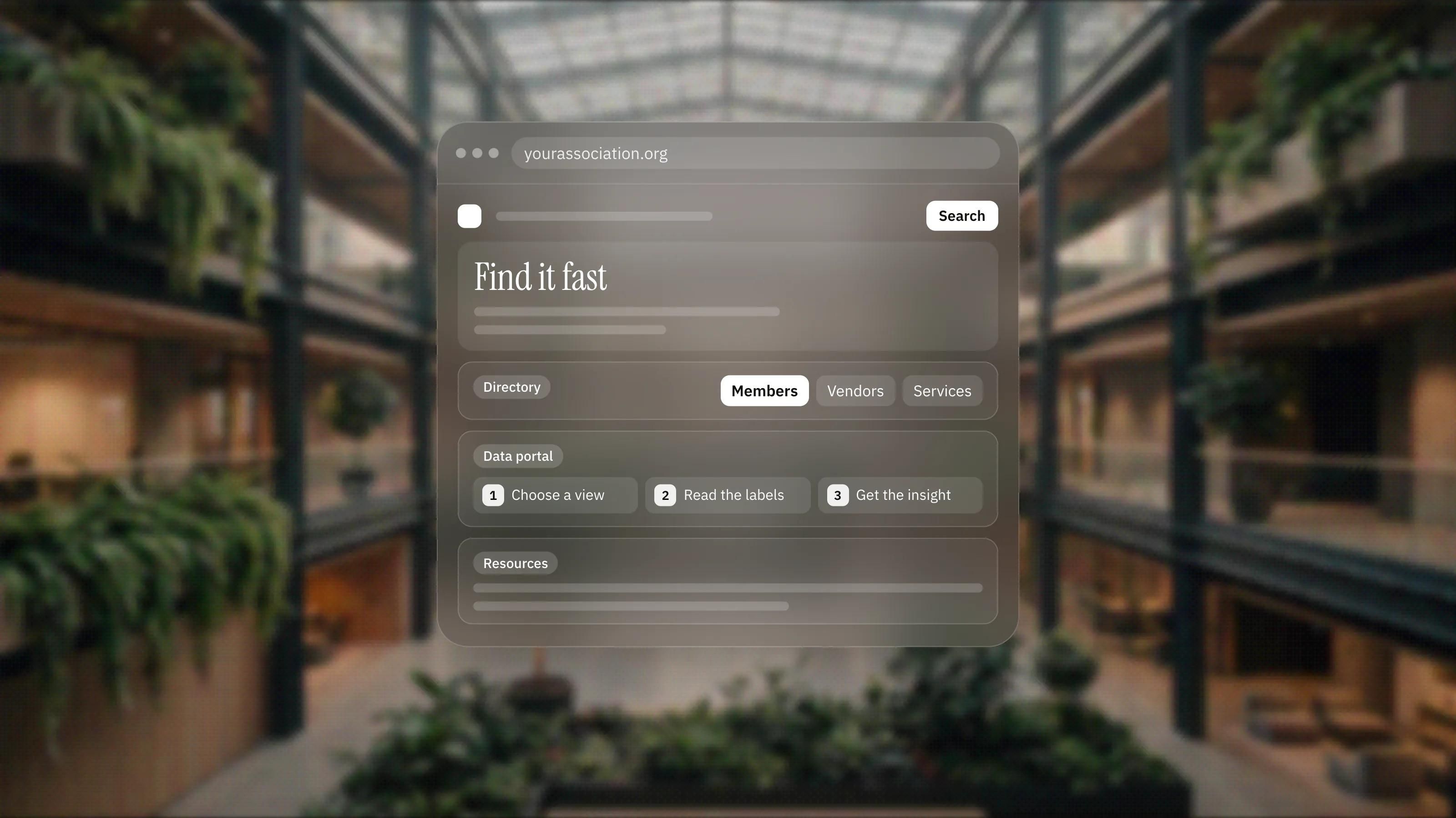
A directory, of members, vendors, or services, is only as good as its search and filtering. If someone cannot narrow a long list by the criteria that matter to them, the directory becomes a wall of names. Thoughtful filters, fast results, and clear individual entries make the difference between a resource people return to and one they abandon.
This is work we know first-hand. We redesigned and rebuilt the website for Polskie Forum HR, the organisation representing the HR services industry in Poland, in Framer, with a CMS its team uses to publish news, sector reports and industry updates without technical support. Projects like these turn on getting the underlying structure right so professionals can find what they need quickly.
How should a data portal present its numbers?
A data portal has to make numbers understandable, not just available. Raw tables rarely help. Clear presentation, sensible defaults, readable labels, and views that guide a visitor toward the insight they came for are what make data usable. The goal is comprehension, so people leave knowing something, not just having seen a spreadsheet on the web.
Performance matters more than usual here, because these sites carry a lot of content. Fast pages, efficient search, and a layout that stays clear on both desktop and mobile keep a heavy site feeling light to use.
Why does accessibility matter for associations?
Associations and public-facing data portals serve broad memberships, which makes accessibility both a duty and a practical benefit. Building to recognised standards, with clear structure, strong contrast, keyboard support, and readable labels, means every member can use the directory and the data, whatever their device or ability.
What makes these sites fail?
Most failures come down to structure, search and speed: navigation built around the org chart, directories without real filtering, data with no context, and pages that slow down under heavy content.
- Navigation built around internal structure instead of how members search.
- Directories with no real filtering, so users scroll endlessly to find a match.
- Data dumped into tables with no context, labels, or guided views.
- Slow performance under the weight of large content and poorly built search.
- A design that looks fine on the homepage but breaks down on deep content pages.
What actually works
For HR platforms, associations, and data portals, success comes from structure, search, speed, and clarity. When people can find members, resources, and data quickly and understand what they find, the platform earns its place in their routine. Everything else supports that.
Our approach fits this work. Framer handles the marketing and content layers quickly and keeps them easy to maintain, while we build directories, portals, and heavier data features with custom React and Next.js, and use Webflow where it suits, always honest about the right tool. As a Certified Framer studio with a senior team who design, develop, and grow without handoffs, working across Poland, Europe, and the US, we keep one accountable team across the whole build.
If you are planning an association site, a directory, or a data portal and want it to be genuinely usable, book a discovery call and we will work through the structure with you.
Frequently asked questions
What should come first when planning an association website?
Information architecture. Decide how members, resources, directory entries and data are categorised, labelled and connected before styling anything, using your audience's terms rather than your internal org chart.
What makes a member or vendor directory useful?
Search and filtering by the criteria that matter to the person looking, fast results, and clear individual entries. Without real filtering, a directory becomes a wall of names.
How do you make a labour-market data portal easy to use?
Present the numbers rather than dumping raw tables: clear presentation, sensible defaults, readable labels and views that guide a visitor toward the insight they came for.
Can an association site with lots of content still be fast?
Yes, if performance is treated as a priority. Fast pages, efficient search and a layout that stays clear on desktop and mobile keep a heavy site feeling light to use.