Real Framer Website Examples and What They Get Right
The patterns strong Framer sites share: clear hierarchy, restrained motion, fast media, and CMS-driven content, plus where to find real examples.
 Written byMatt Gemi, Founder, Urest
On this page
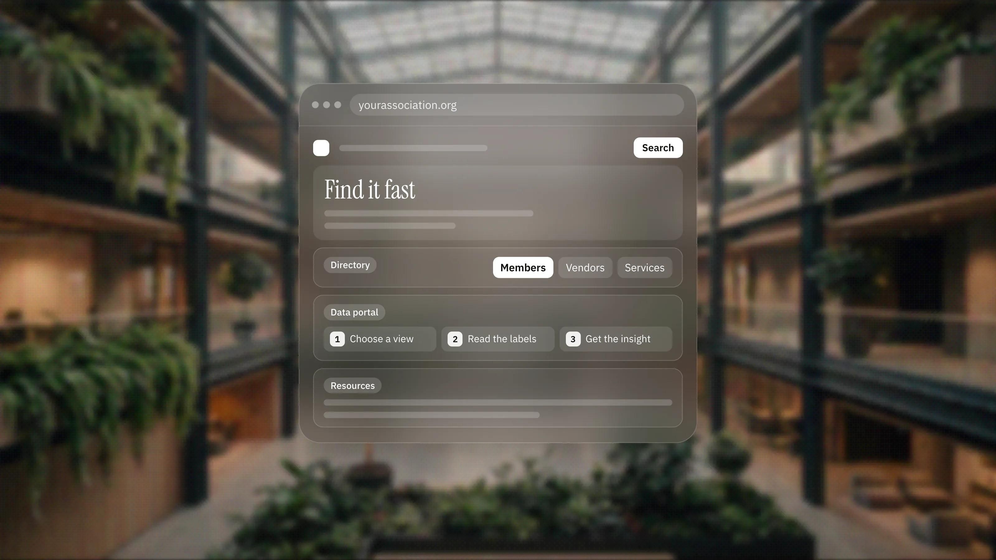
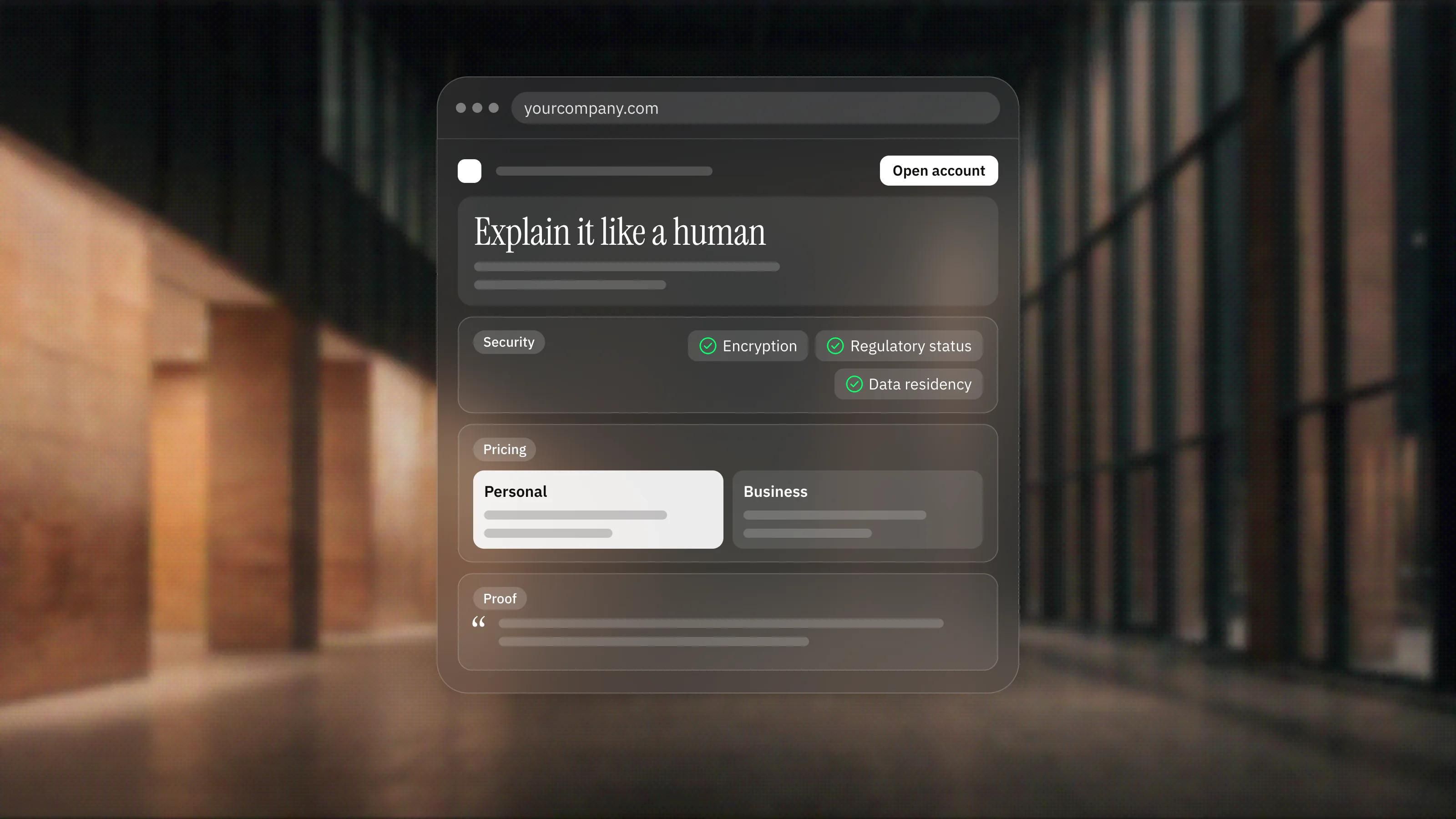
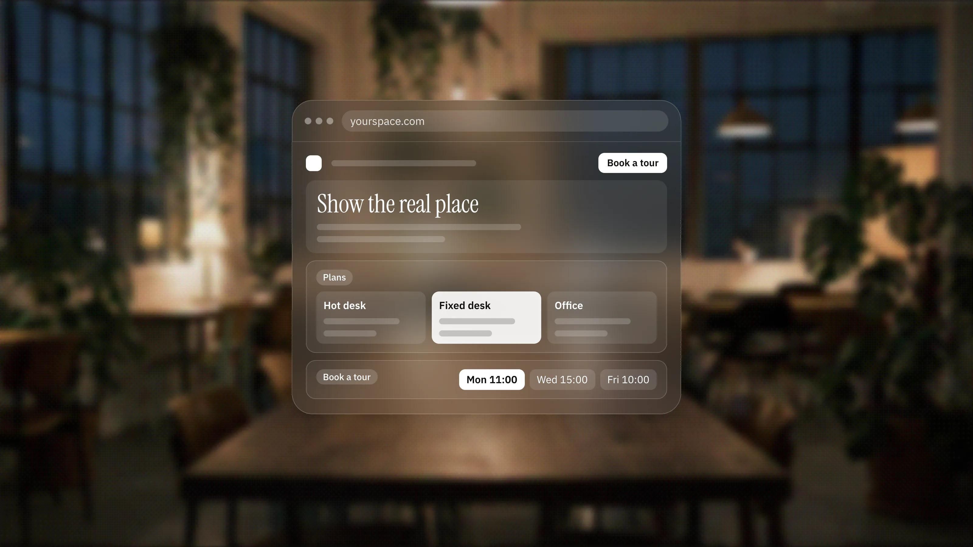
The best Framer sites rarely win because of one flashy trick. They win on fundamentals done consistently: a clear hierarchy, motion used with intent, fast media and content that scales through the CMS. Rather than name sites that may change or come down, here are the patterns worth copying and where to see them live.
Where to find real examples
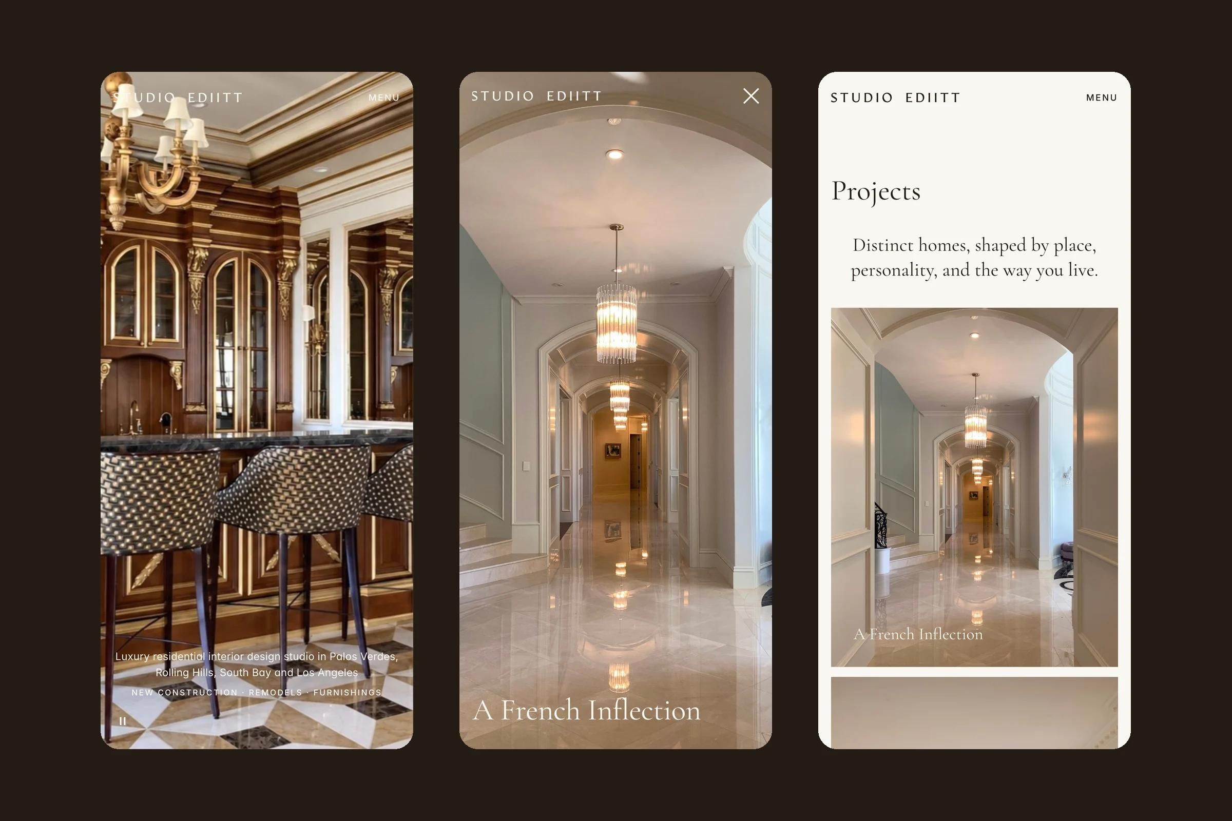
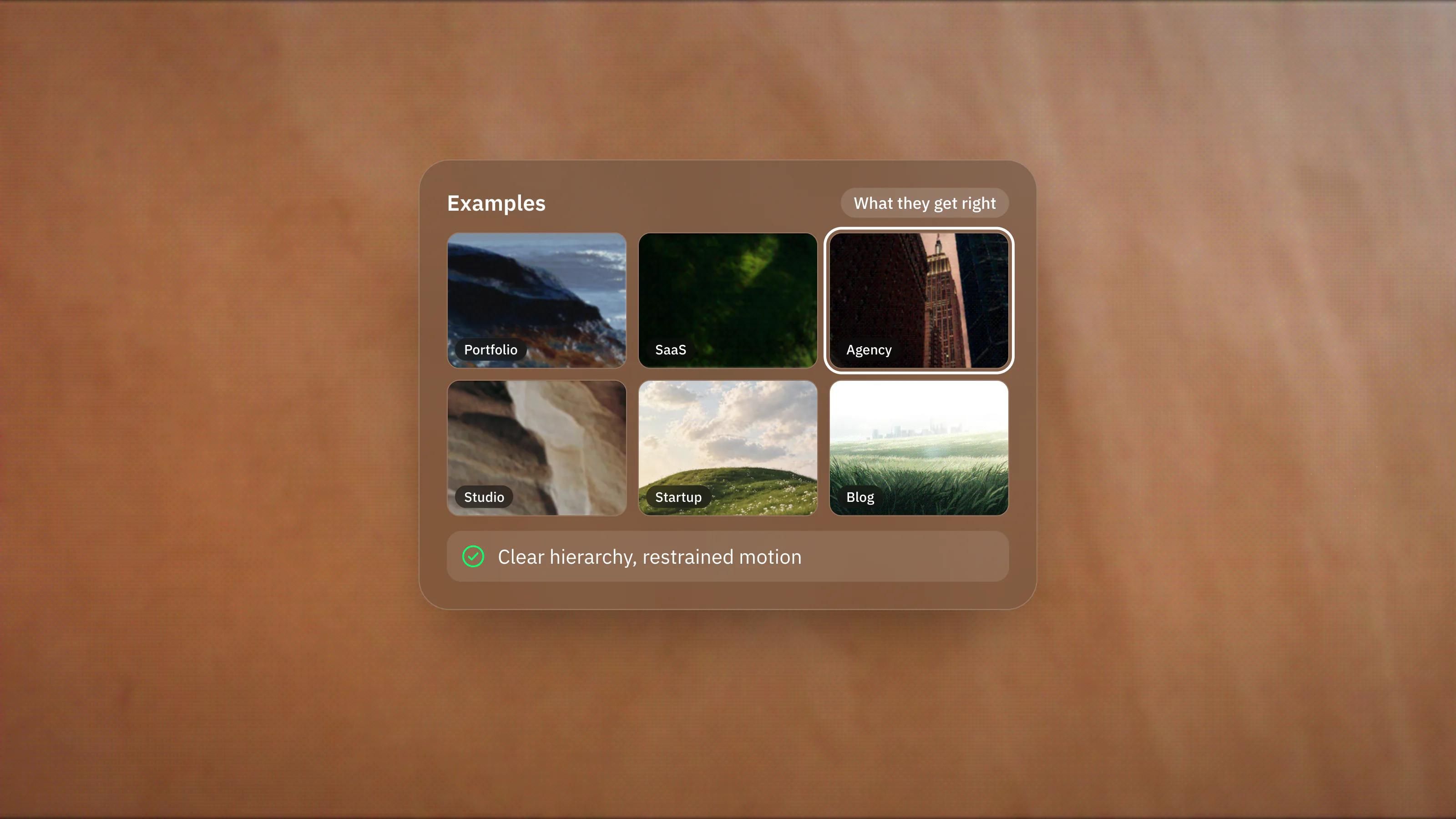
The most reliable place to browse current work is the Framer Gallery, Framer's own showcase of sites built with Framer. It is organised into categories such as Portfolio, SaaS and Agency, so you can study examples close to your own use case. Because it shows published sites, you are looking at real work rather than mockups.
Clear hierarchy and generous space
Strong Framer sites tend to lead with one confident headline, a supporting line and a single primary action, then let the rest of the page breathe. Generous spacing and a restrained type scale do more for perceived quality than decoration. When you browse the gallery, notice how often the first screen asks you to do exactly one thing.
Motion with restraint
Framer makes animation easy, which is precisely why the good examples hold back. Effective motion guides attention: a gentle reveal as a section enters, a subtle hover state, a smooth transition between views. Overused, the same tools make a site feel busy and slow. A useful test is whether the motion would be missed if it were removed. If not, it is probably decoration.
Fast media that respects the visitor
Because Framer resizes and compresses images automatically and serves modern formats such as AVIF, according to its hosting guide, the sites that feel fastest are usually the ones that also avoid stacking oversized video and heavy media on a single view. The platform gives you a strong baseline, and the best examples do not undo it. Watch how the quicker sites in the gallery sequence their media rather than loading everything at once.
Content that scales through the CMS
Many of the more substantial examples, blogs, case study libraries, job boards, are built on the Framer CMS. One template page drives many entries, which keeps the design consistent and makes the site easy to grow without touching the layout each time. If a site has dozens of similar pages that all feel coherent, that consistency is usually the CMS doing its job.
If you are gathering inspiration before a rebuild, it helps to translate what you admire into decisions your own audience needs. That is the kind of work we do across design, development and growth. Book a discovery call and we will help you turn references into a plan.