
Modulor Audio
Website redesign and Framer development
Industries
Resources
The brief
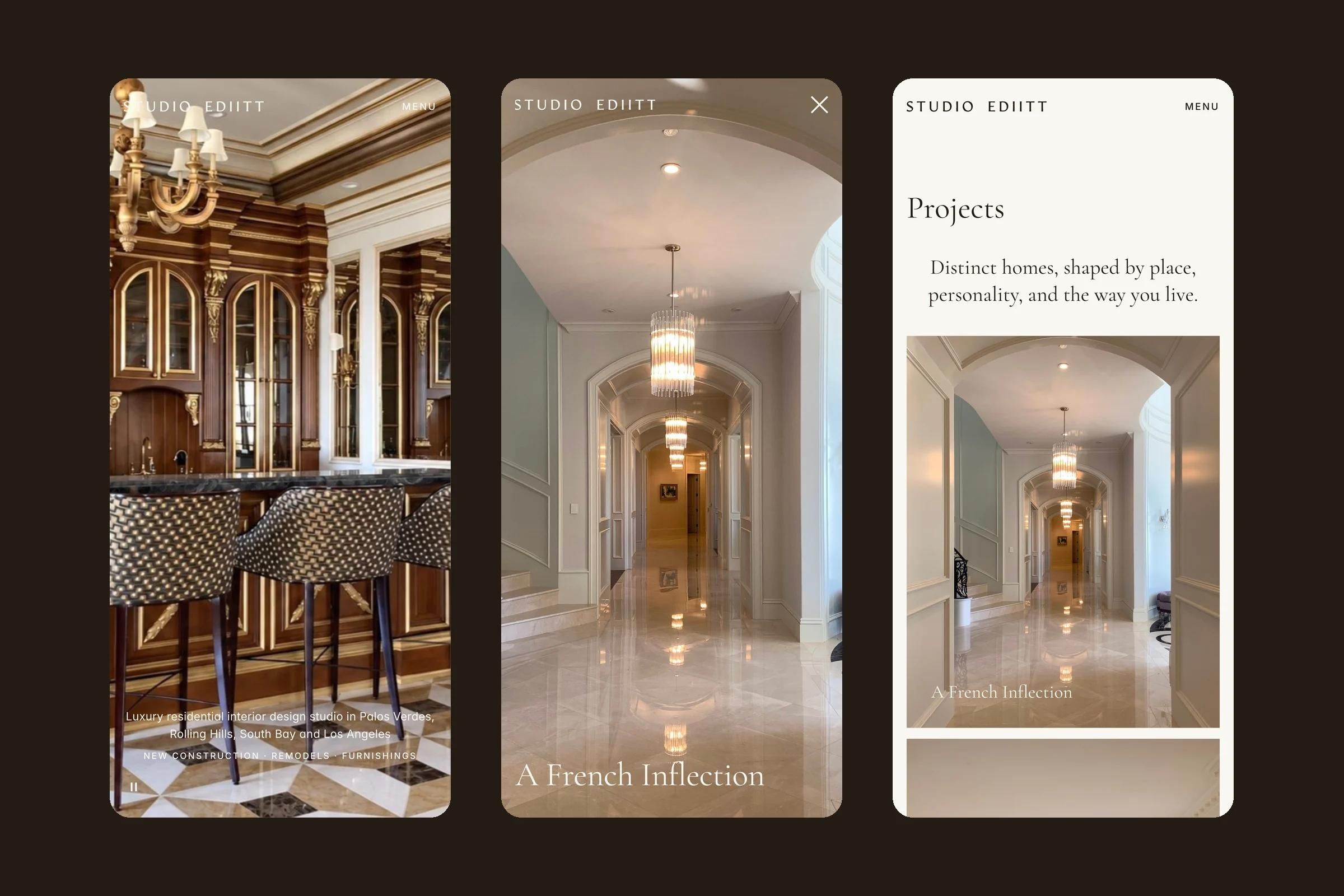
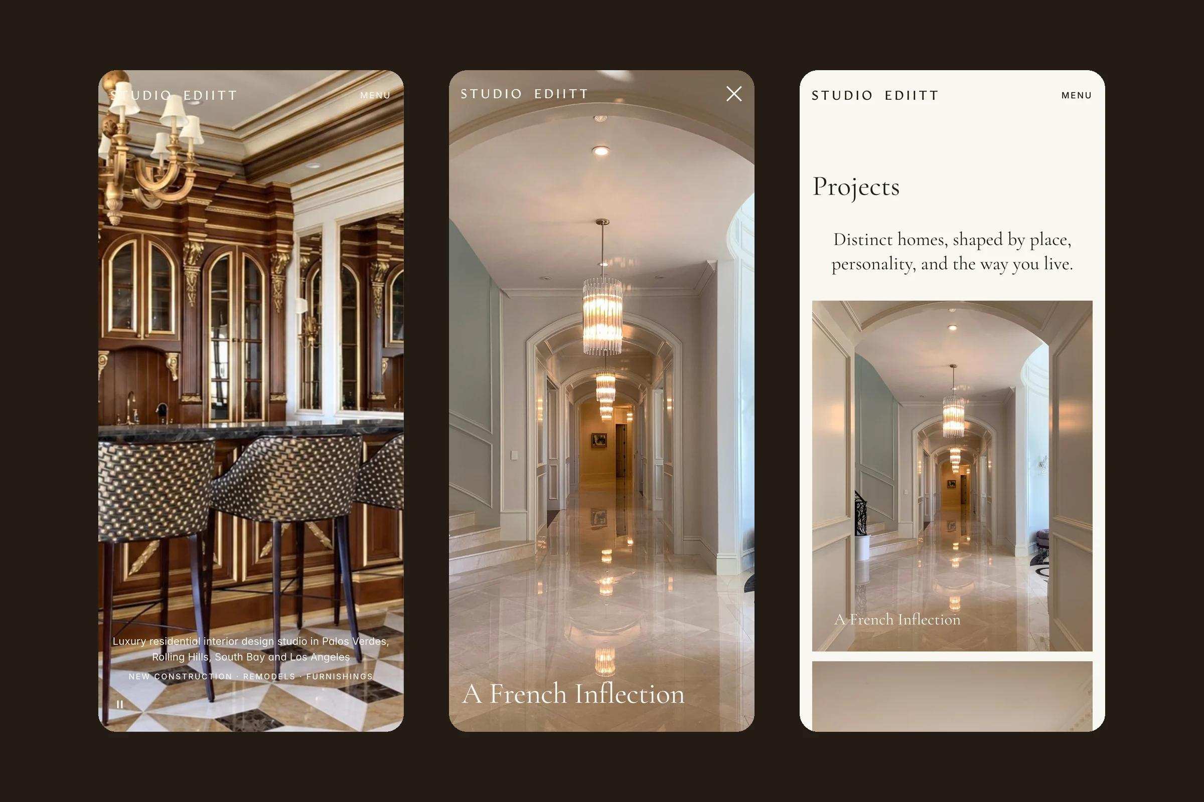
A new website for STUDIO EDIITT, a residential interior design studio in Palos Verdes, California. The client arrived with a clear art direction of her own: a written brief, a type specification, the opening lines and a page-by-page slide deck with her photo crops. We turned that vision into a strict Figma system and then a custom Framer build, 13 page templates on four breakpoints with six CMS collections, where every note became a measurable rule.
At a glance
Day by day
The days as they happened, from the first moodboard to launch.
Day 1
Day 2
Day 3
Day 6
Day 9
Day 10
Day 11
Day 12
Day 16
Launch
Urest
Point at a day, or tap it, to see what happened.
01
STUDIO EDIITT is a residential interior design studio founded by Catherine and Konni. It works on new construction, remodels and furnishing projects across the Palos Verdes Peninsula, Rolling Hills, the South Bay and coastal Los Angeles.
We designed every page in Figma, then built the site in Framer from scratch, without a template, with the CMS, motion, responsive behaviour, SEO basics and launch QA.
02
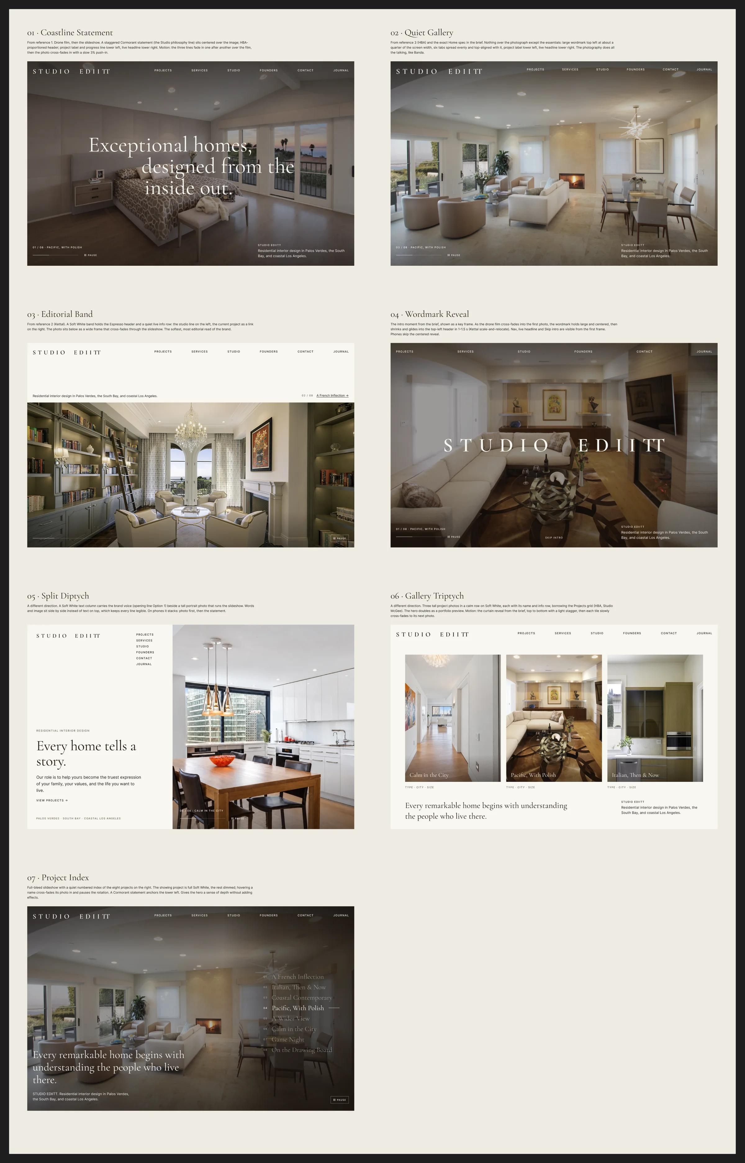
Catherine had worked out the art direction herself before we started. She supplied:
Our job was not to reinvent that idea. It was to turn a slide-deck vision into a precise, living website that behaves exactly as she imagined on every screen. We did not rewrite any of her copy.
Every note in the client's slide deck became a measurable rule: a margin, a column position, a timing or a crop.
03
A slide deck shows one fixed screen. A website has to hold the same composition on a large desktop, a laptop, an iPad in both orientations and a phone.
The client sent detailed, numbered feedback rounds, including a site-wide list of 24 rules before launch. Each note had to be turned into something we could build and measure: a margin, a column position, a timing or a crop.
The studio's homes are the content. Every crop had to follow the client's decks, keep its colours and never be cut off on a short laptop screen.
Projects, services, founders and the journal had to be editable by the studio without touching the design.
04
We started with a moodboard in Figma, then home hero concepts and two rounds of section ideas, built around the three hero references the client liked. Catherine chose Quiet Gallery, opened by a wordmark reveal. From there every page was designed in Figma on desktop, laptop, tablet (upright and sideways) and phone before any Framer work, and each feedback round was applied in Figma first, then in Framer.
05
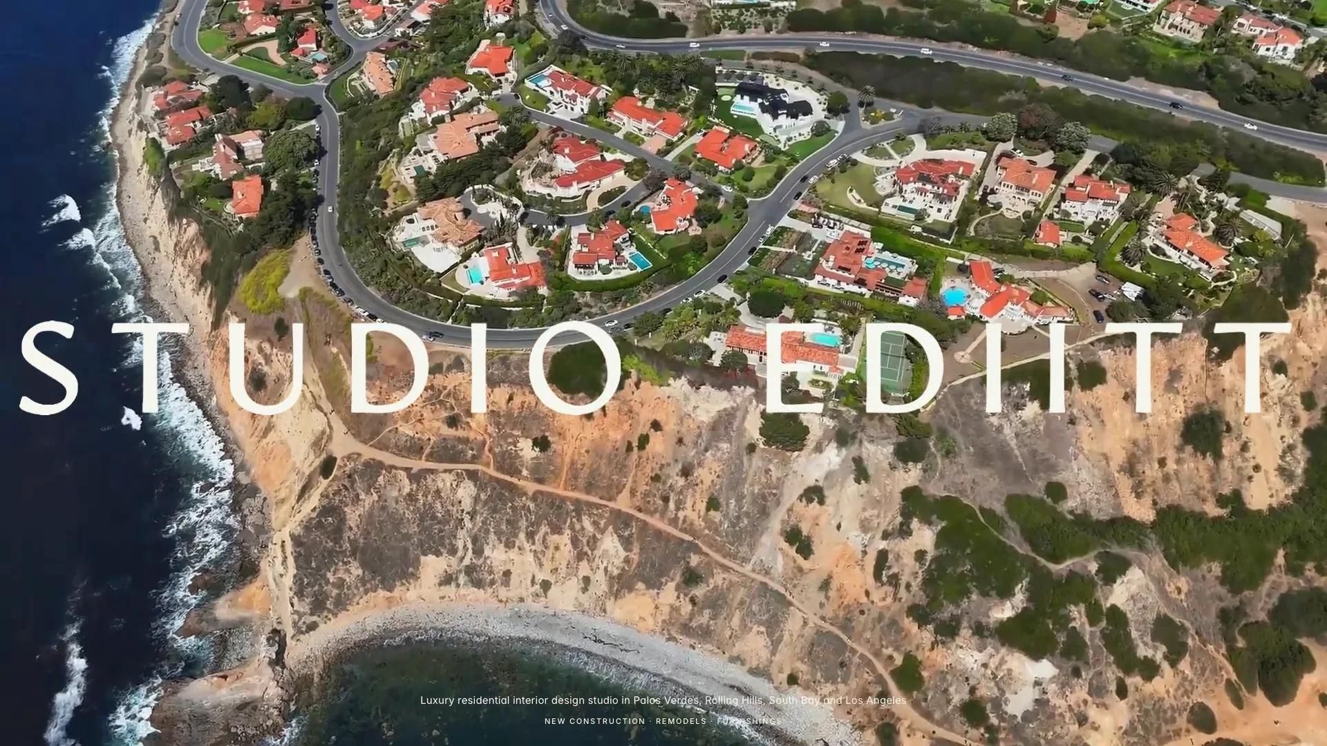
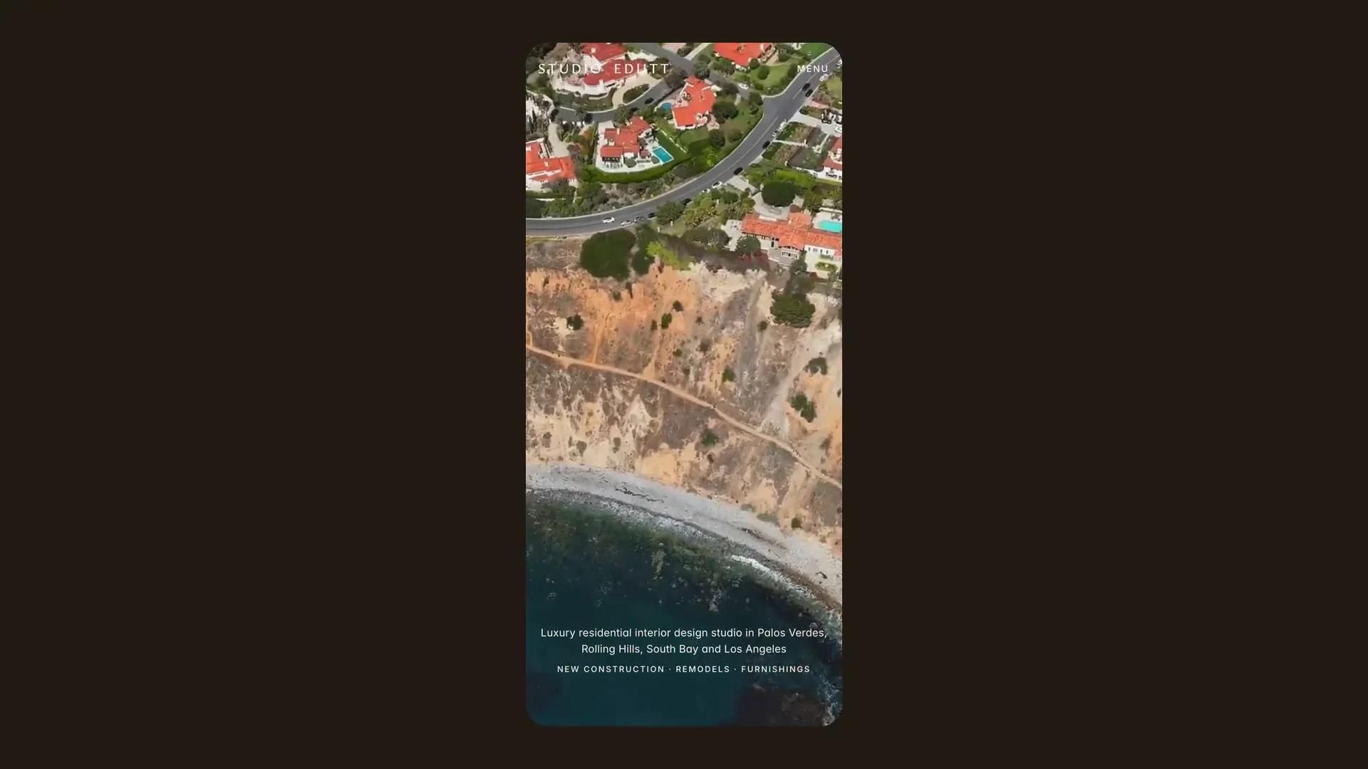
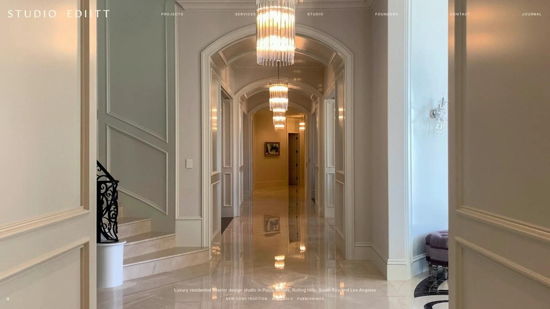
The opening follows the client's own storyboard. On desktop and tablet a drone film of the coast plays full screen with no header. About a second in, the large Soft White wordmark fades in over the film, holds, then slowly shrinks and glides into its place in the header. The glide is timed from the film's own clock, so it lands exactly as the film ends, even if the video buffers. The film then cross-fades into the first project photo, the navigation flips in and the slideshow starts.
The hand-over between the large wordmark and the header wordmark is seamless: the measured difference at landing is 1.3 px or less on desktop and 0.4 px on tablet. On phone the wordmark sits in the header from the start while the film plays. The opening plays once per visit.
06
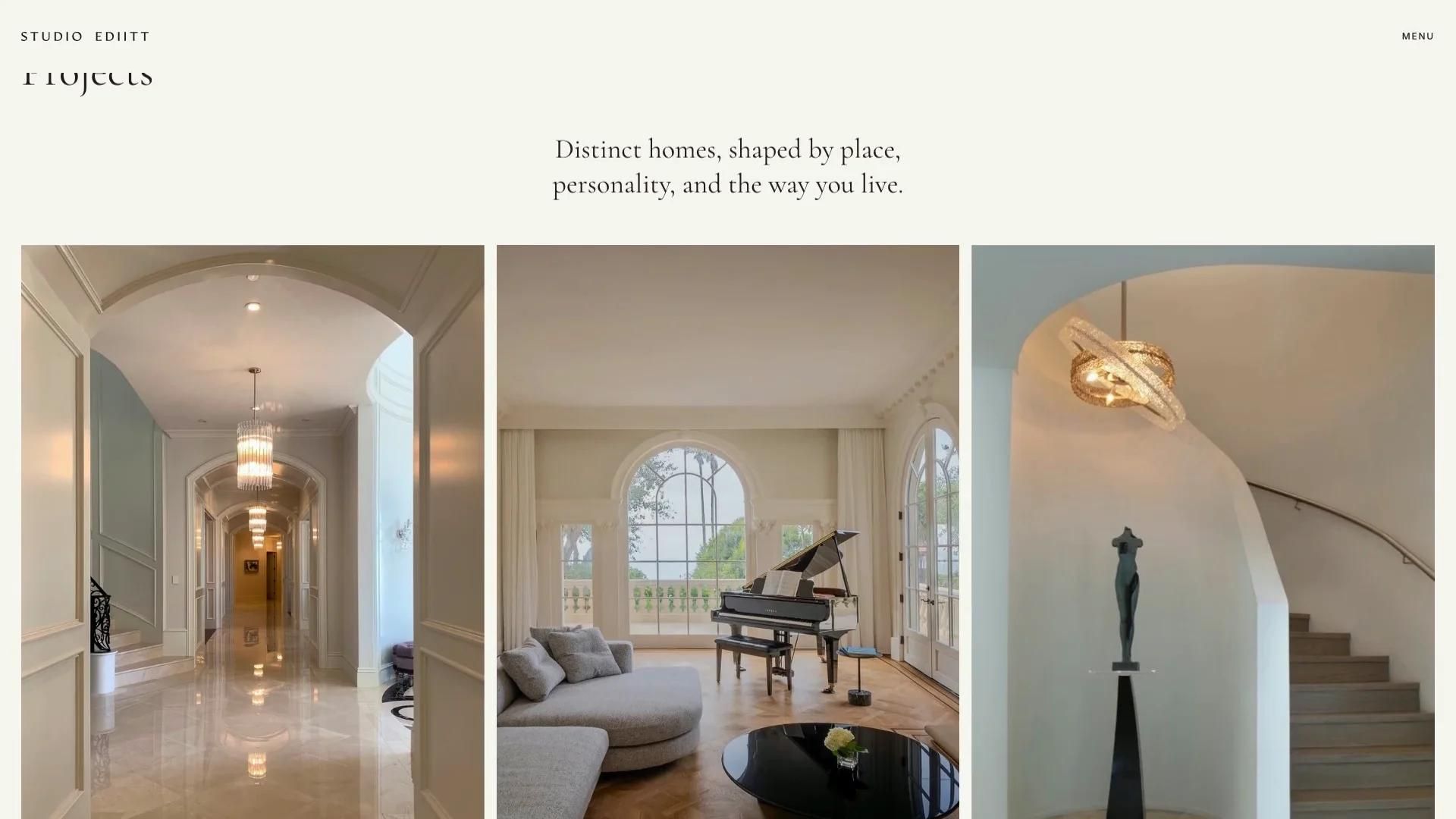
The site runs on 13 page templates, each on four breakpoints:
07
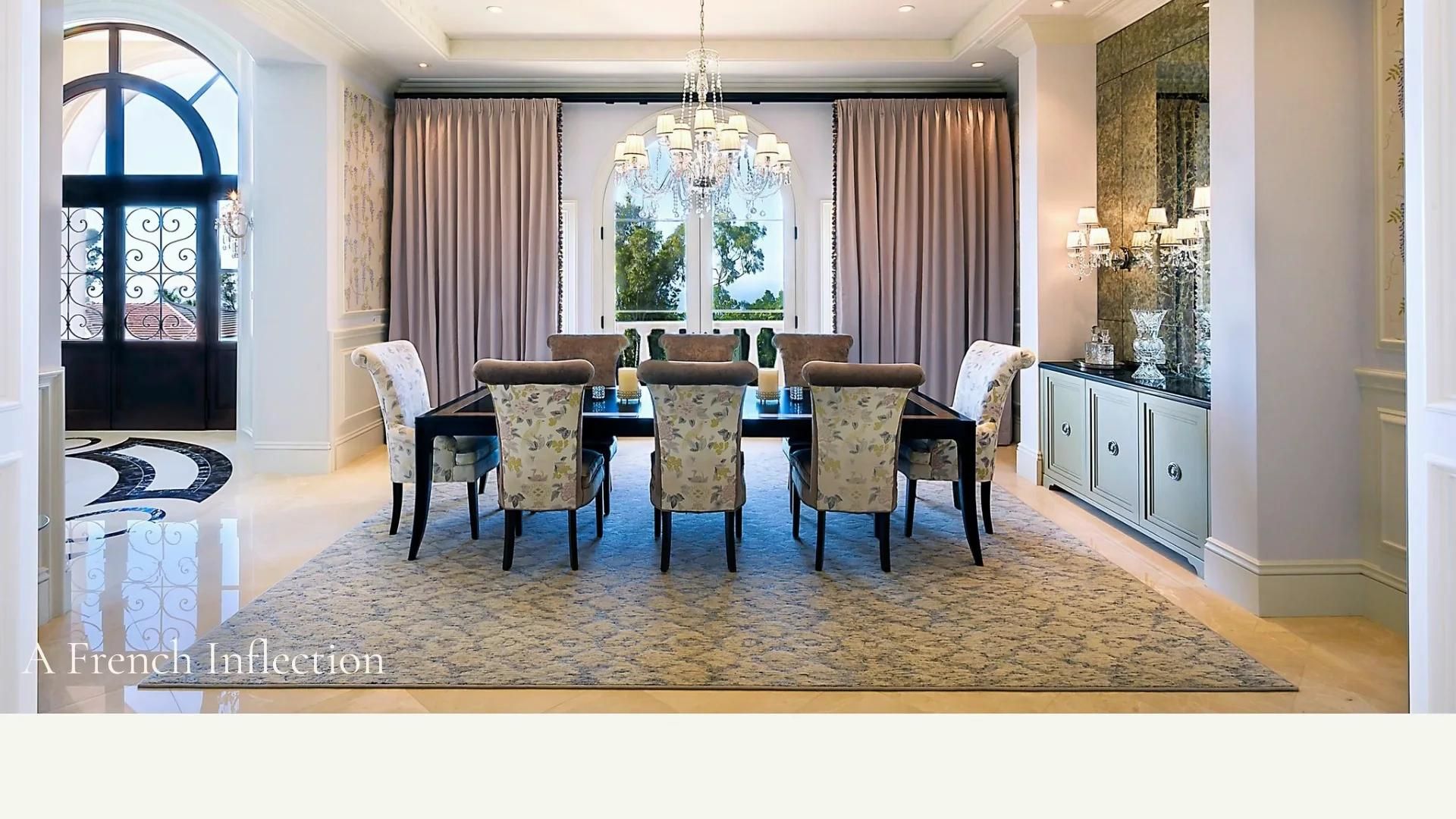
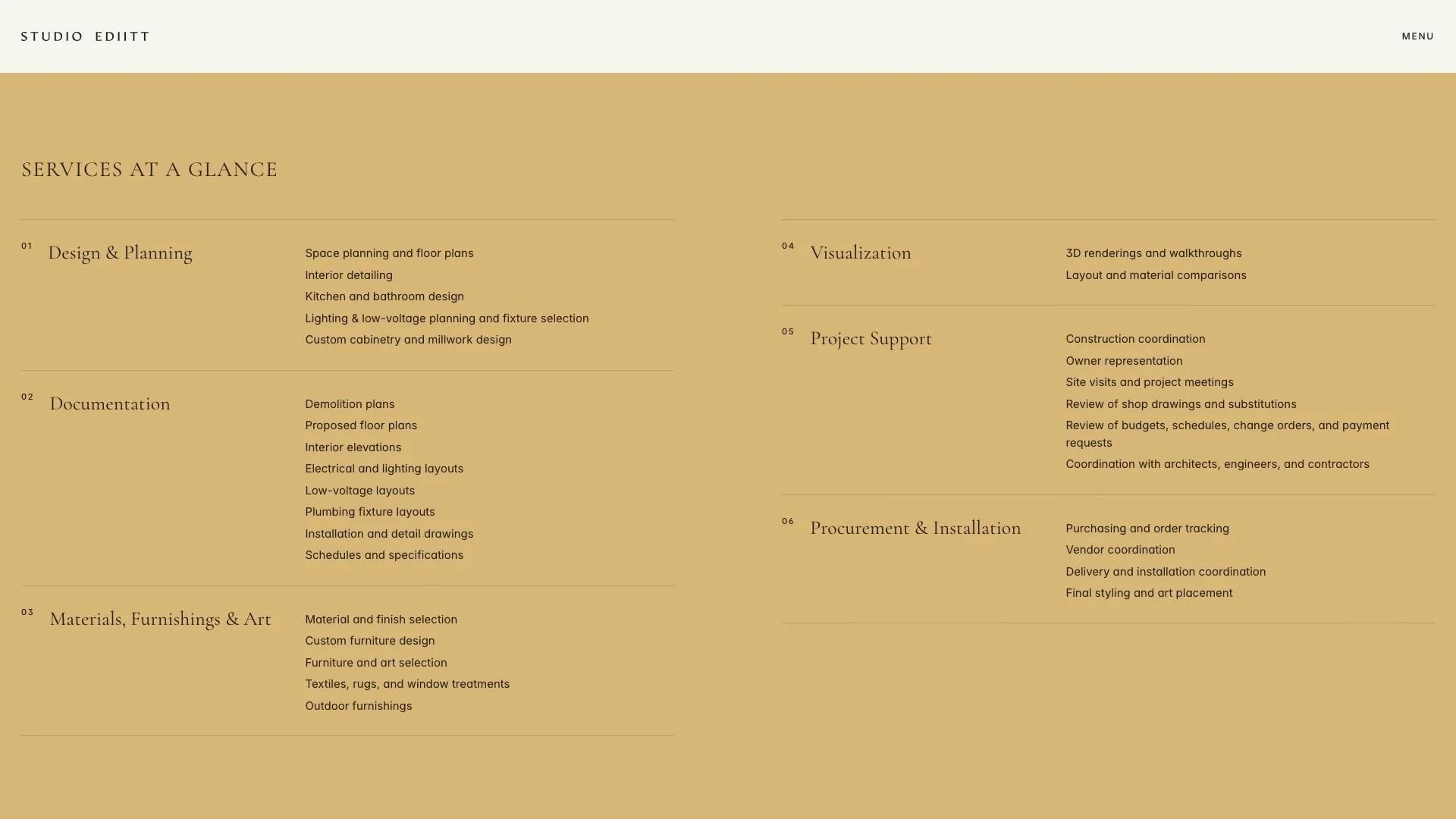
Catherine asked for a site that fits the screen it is on. The header and every section run full width with no maximum width, and the side margins scale with the screen, from 16 px on a phone to 28 px on a large desktop. Framer padding fields only accept pixels, so the fluid margins are applied with a small Framer code override.
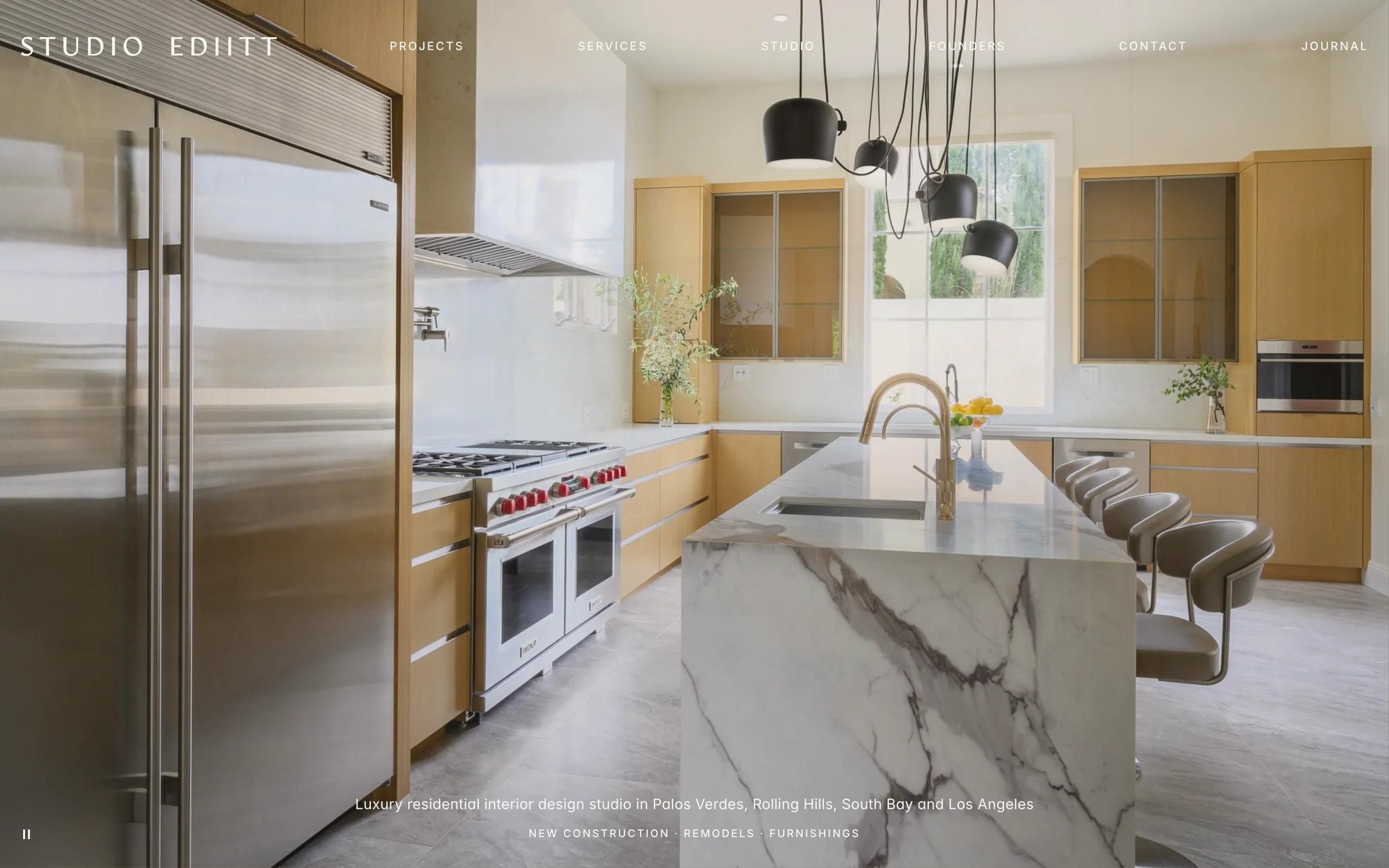
Each photo-and-text section is sized from the screen height: the photo keeps its own proportions, is capped at five columns of a 12-column grid and is always shown whole below the header, never cropped. On phone the sections stack, photo first.
The header is transparent over the hero and turns solid once the hero has scrolled away. On phone and tablet it opens a MENU drawer with a 64 by 44 px tap area.
08
Photos roll open from the bottom as they come into view, and images load a screen and a half ahead so a frame never opens empty. Process stages rise in one after another. Smooth scrolling runs on every page and switches off on touch devices and for visitors who prefer reduced motion.
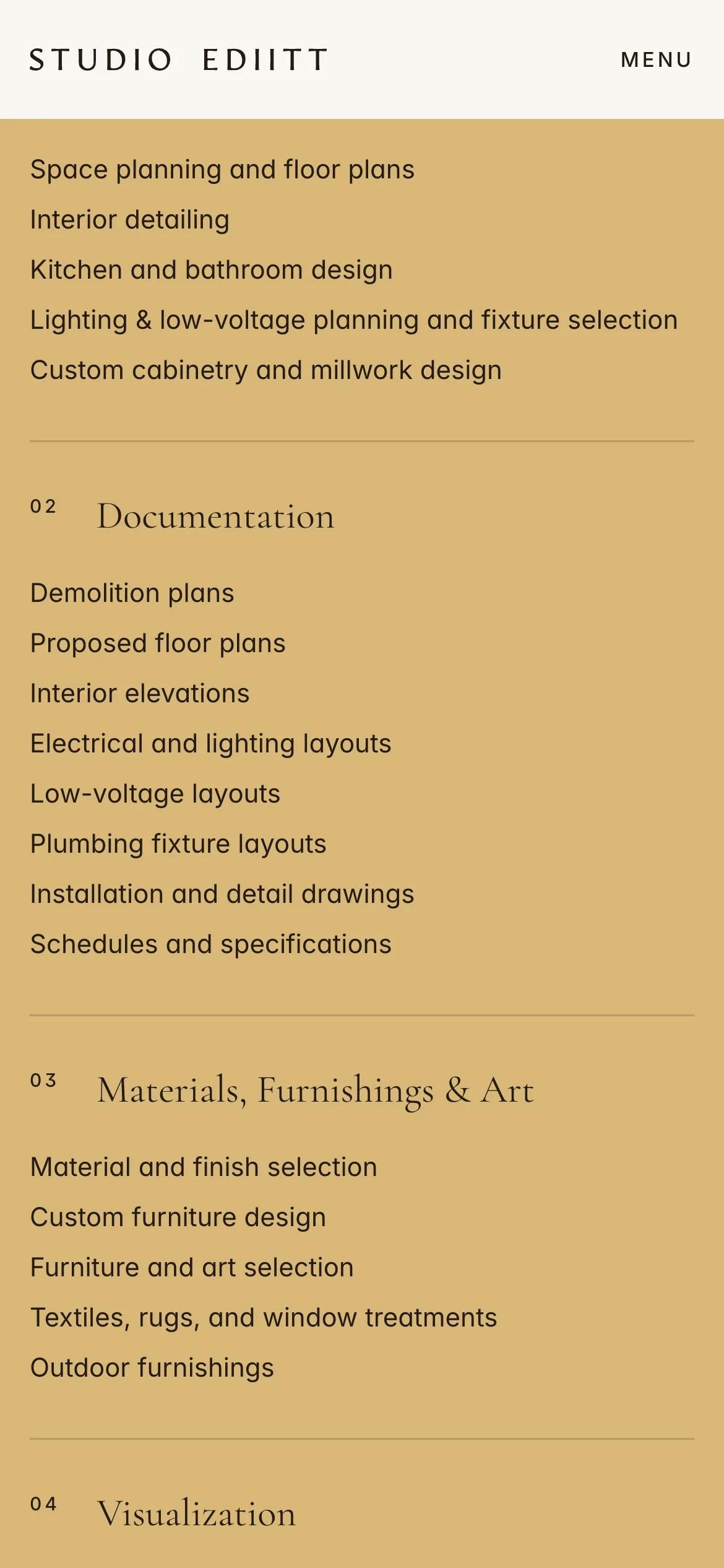
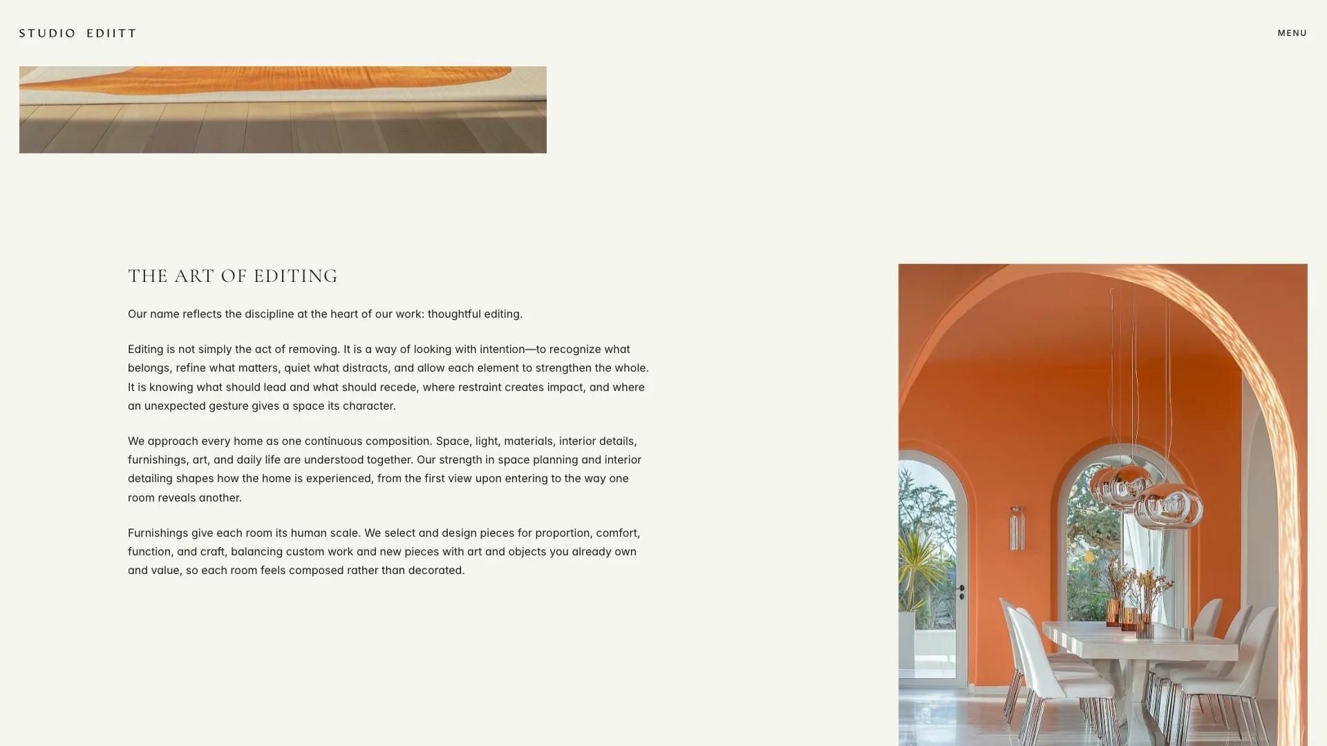
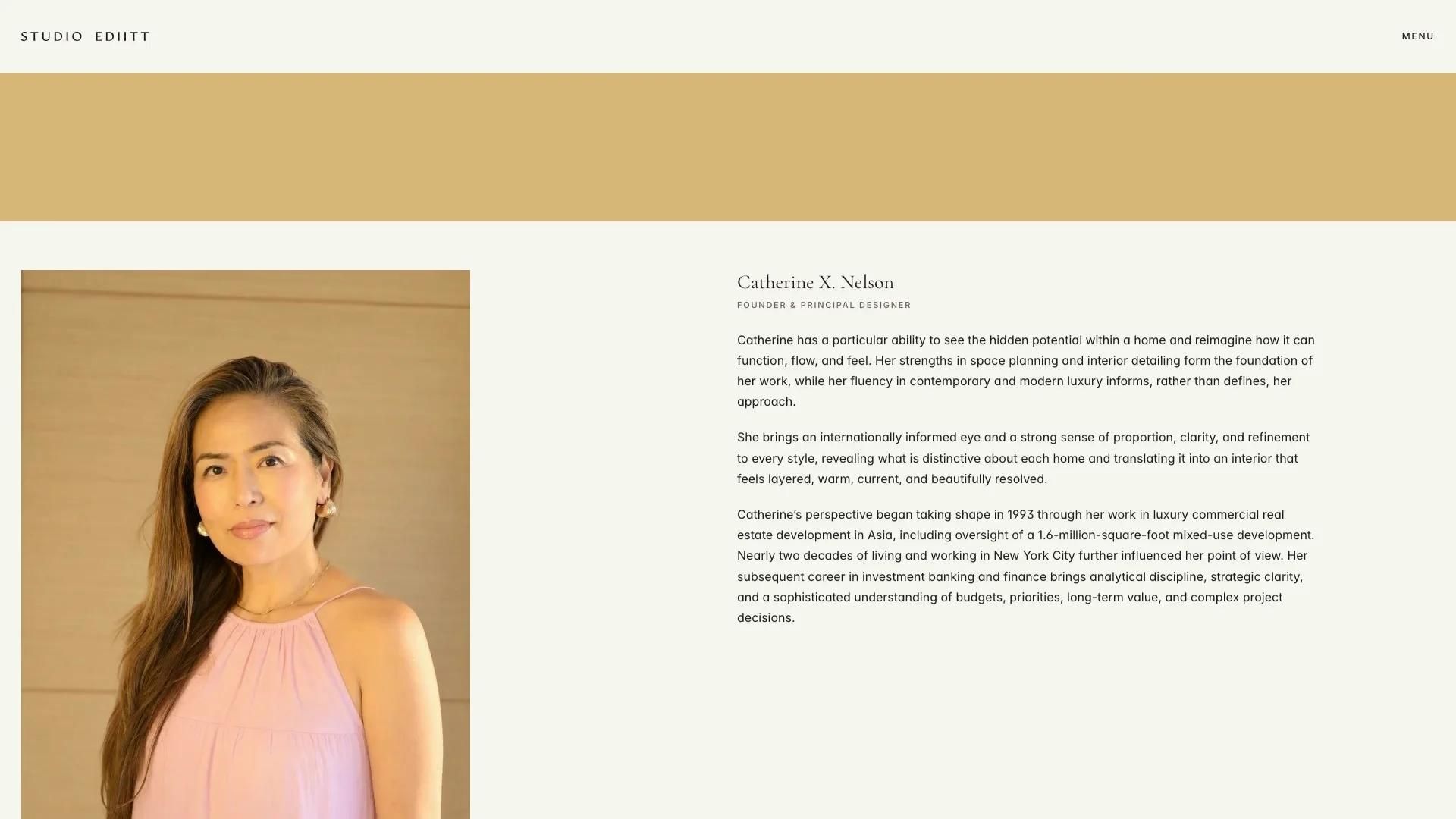
Every crop follows the client's decks. We recovered the exact crop rectangles and the original images from her presentation files, re-exported crops that had lost their colour profiles to sRGB so they match her originals, and gave project heroes their own phone crops. We also vectorised her wordmark into a clean SVG in both brand colours and made the favicon from its E.
09
Projects, services, the team, journal categories, journal articles and the legal text live in six Framer CMS collections. The studio can add a project or an article without touching the design: CMS pages build their own titles, descriptions and share images from their fields. The home slideshow and the opening film are swapped from the right panel in Framer.
The inquiry form and the newsletter sign-up send to the studio's inbox, with a consent line linked to the Privacy Policy. Framer Analytics was the client's choice, so the site carries no cookie-heavy trackers.
10
Before and after launch we measured the site rather than eyeballing it, on ten representative pages at six real screen sizes: 1920 by 1080, 1440 by 900, 1440 by 780, an iPad sideways and upright, and an iPhone. The header wordmark and the last tab sit exactly on the margin at every size, content edges line up with it, there is no horizontal scrolling and no photo is taller than the screen below the header.
Launch-day issues we caught ourselves and fixed: tablets briefly showing the desktop header, the phone skipping the opening film after an interrupted video copy, a hidden full-width layer making phones render pages at half size, and project gallery photos that were taller than laptop screens.
Process
The client's brief, copy, type specification, palette, wordmark and page-by-page slide deck.
Seven home hero concepts and two rounds of section ideas in Figma. The client chose Quiet Gallery with a wordmark reveal.
All pages designed on desktop, laptop, tablet upright and sideways, and phone.
13 page templates on four breakpoints, six CMS collections, styles and components, built from scratch.
The film-timed wordmark opening, the slideshow, photo reveals and smooth scroll.
Each round of the client's numbered notes applied in Figma, then in Framer, and checked on desktop, iPad and phone.
Ten pages measured at six real screen sizes, before and after launch.
SEO basics, share images, forms and analytics set up, and the project handed over to the studio.
Services used
IndustryReal estate and built environmentCreative industries
Keep reading
Website redesign and Framer development
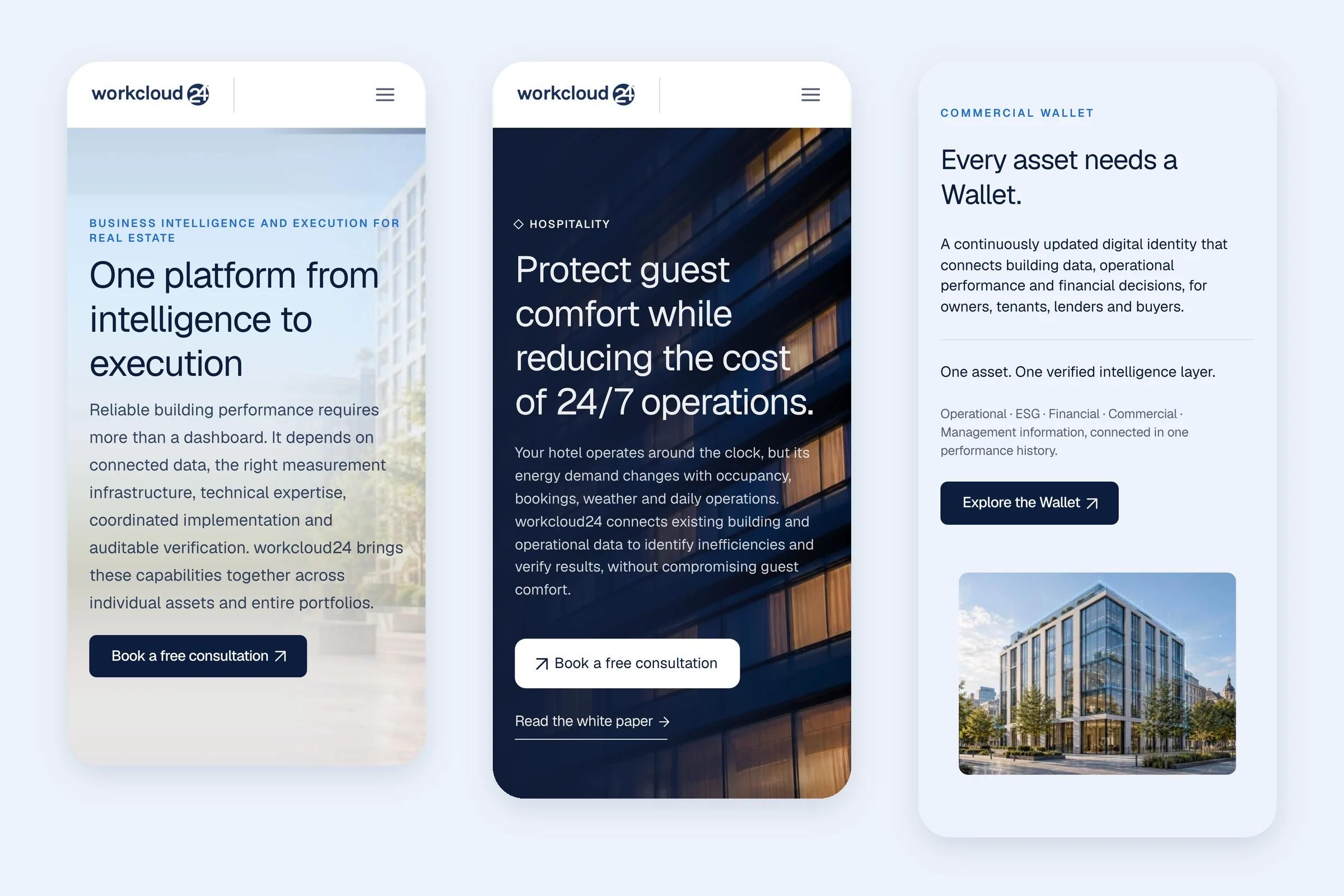
Website redesign and Framer development
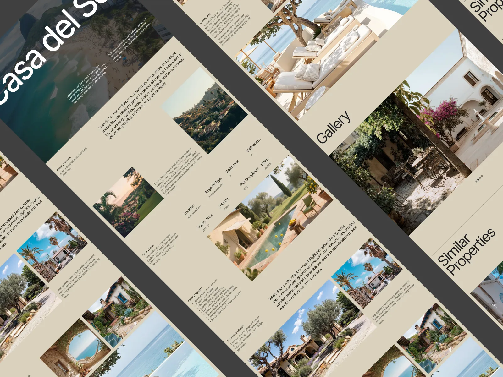
Framer template design and development

A 30-minute call. We will look at where you are, what is not working, and what we would do about it. No deck, no pitch.
Cookies
We use analytics cookies to see which pages and links bring people to a call. Nothing is stored until you agree. Privacy policy
Hi, I'm Seru, Urest's assistant. Ask me about our services, process or work.
Try asking