



What are responsive breakpoints?
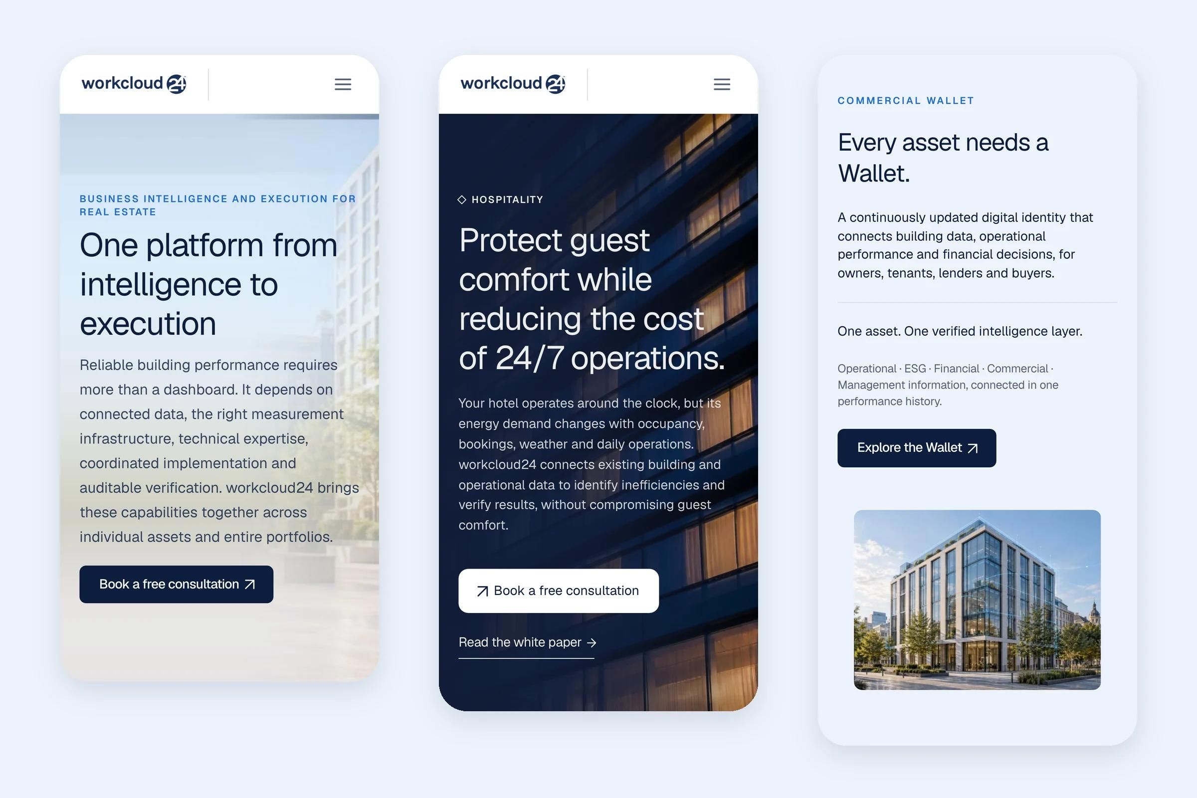
Responsive breakpoints are the screen widths at which a website's layout changes to fit the device, for example from a three-column grid on desktop to a single column on a phone. They are set with CSS media or container queries in code, or as desktop, tablet and phone views in builders such as Framer.
Choosing breakpoints
Set breakpoints where the content starts to break, not around specific phone models. Many sites use three or four, such as a wide desktop, a laptop, a tablet and a phone. Framer starts new projects with desktop at 1200, tablet at 810 and phone at 390 pixels wide.
What changes at each breakpoint
Column counts, type sizes, spacing, navigation patterns and image crops. Good responsive design also checks the widths between breakpoints, where layouts often look their worst.
Testing on real devices
Emulators are a starting point. Real phones reveal problems with touch targets, safe areas, browser bars and performance that a resized desktop window misses, and unexpected movement shows up in Cumulative Layout Shift.